Christy Rae SCC WEB120 Big Project
Flexbox Research
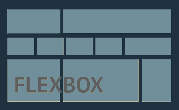
Flexbox Layout was brought forward as a new layout module in CSS3 to make improvements over the constant use of ‘float’ to work around layout formatting issues. It was designed to make improvements in aligning items in containers and is specific to helping with alignment when these elements are dynamic or will be of unknown size. Ohans Emmanuel states this best in the article ‘Understand Flexbox - Everything You Need To Know’ on freeCodeCamp.com when he says, “According to the specification, the Flexbox model provides for an efficient way to layout, align, and distribute space among elements within your document — even when the viewport and the size of your elements is dynamic or unknown.” (Emmanuel).
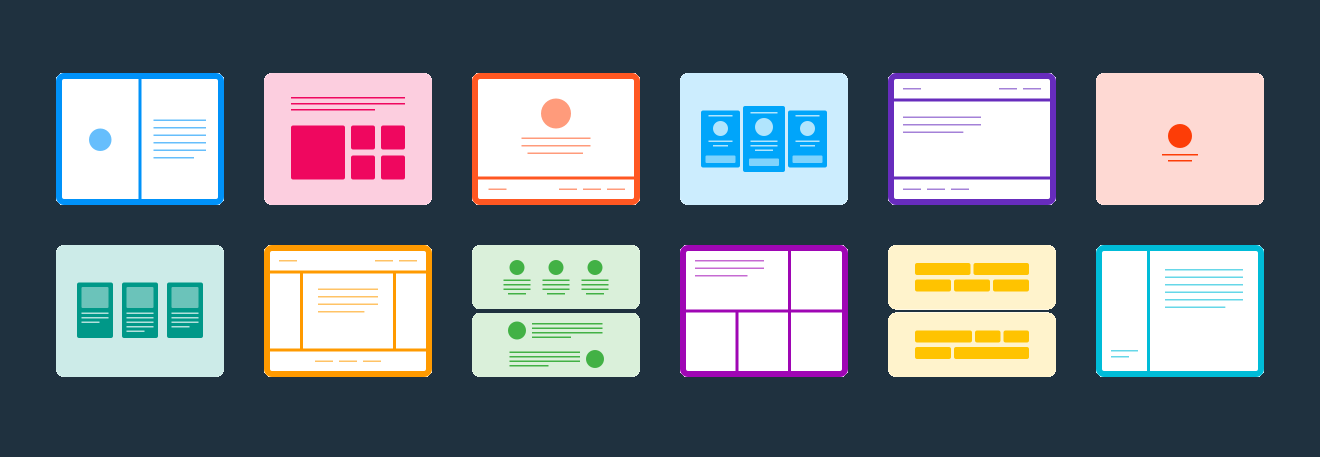
So when and why should we use flexbox? If you have items that need to lay in a single column or row, flexbox will wrap these items into the container and flex to take up the space in balance or reduce in size to avoid overflow. Flexbox can even be used in nested fashion, as Scott Vandehey shares in Space Ninja, “By nesting multiple flex containers with different orientations, you can achieve complex layouts.” (Vandehey)
 One example of flexbox and it’s easy use in coding is:
.flex-container {
    display: flex;
}
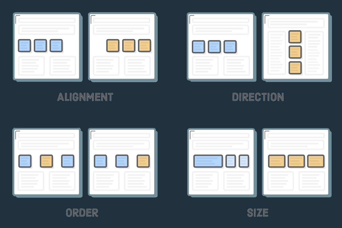
In Space Ninja, Vandehey lists out how this simple code does all of the following:
- "Treats .flex-container as a flex container.
- Treats all direct children of .flex-container as flex items.
- Flex items will be laid out in a horizontal line.
- Flex items will be laid out in source order.
- Flex items will be laid out starting from the left side of the flex container.
- Flex items will be sized based on their regular width properties.
- If there’s not enough space for all the flex items, they will be allowed to shrink horizontally until they all fit.
- If they need to shrink, each item will shrink equally.
- Flex items will all stretch vertically to match the height of the tallest flex item.”(Vandehey)
What all of this does in the end is that all of the aligned space between these flex elements end up working very well with responsive design, something that all designers must be aware of as clients increasingly want their websites to work on all devices.
This all sounds great, but there are points within any design where you should not use flexbox. Ohans Emmanual points out in the article ‘Flexbox Is Awesome But Its Not Welcome Here’ on freeCodeCamp.com that, “Flexbox was not designed to be used as a full grid system. Even though you may equally bend the Flexbox model to do your bidding, and I have on many occasions, it still doesn’t change that.” (Emmanuel) That being said flexbox should definitely not be used for the full page of design, it is best used for element blocks to control spacing. On Brolik.com, Alex Caldwell clearly guides when he says, “A basic grid system using percentages, max-widths, and media queries is a much safer approach for creating responsive page layouts.” (Caldwell)
Keep in mind that Flexbox has been growing since 2009 and as of 2017 is supported across all current browsers, however, older browsers will skip over this code as something it doesn’t understand and will resort to default behavior for placement of any elements styled using this method.
All in all Flexbox seems like with a balanced use in a design can fix issues with elements that need to be carefully balanced on a website and also react to responsive screen settings and can be something will see a well developed layout.